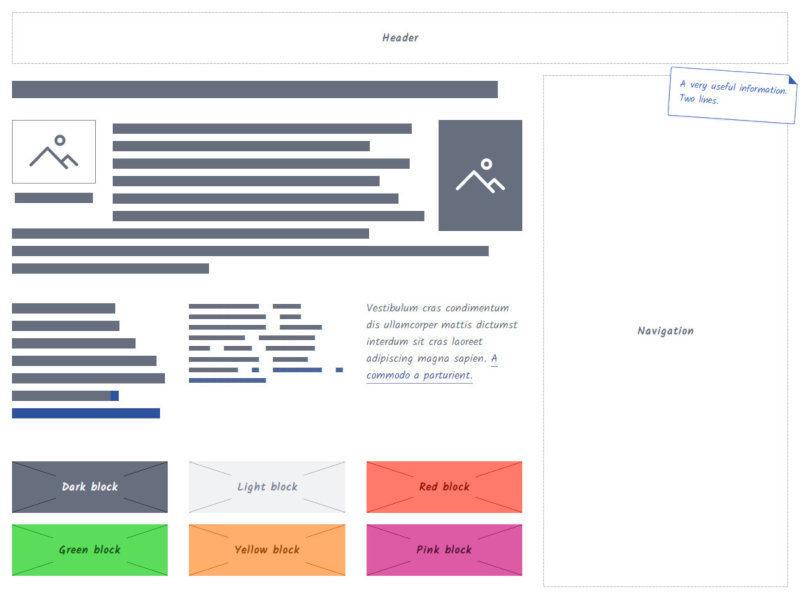
css-wireframes
CSS framework to quickly design responsive wireframes directly in HTML.
 css-wireframes
A CSS framework to quickly design responsive wireframes directly in HTML.

Getting started
-
Download a release, then put the CSS and Javascript files in your project folders.
-
Include your favorite CSS grid system in the
<head>, then the wireframe CSS and Javascript.
<!-- Grid system of your choice -->
<link rel="stylesheet" href="https://cdn.jsdelivr.net/bootstrap/4.0.0-alpha.6/css/bootstrap-grid.min.css" type="text/css" />
<!-- Wireframes CSS -->
<link rel="stylesheet" href="css/wireframes.css" type="text/css" />
<!-- Wireframes Javascript -->
<script type="text/javascript" src="javascript/wireframes.js"></script>
    …
- Compose your ergonomy by putting blocks where you want, and apply wireframe classes when needed.
<div class="container">
  <div class="wf-block">Header</div>

  <div class="row">
    <div class="col">
      <h1>
        <span class="wf-text-lines wf-text--important">
          Lorem ipsum dolor sit amet
        </span>
      </h1>
      <p>
        <span class="wf-text-lines">Vestibulum cras condimentum dis ullamcorper mattis dictumst interdum a commodo a parturient.</span>
      </p>
    </div>
    <div class="col-md-4 wf-optional">
      <div class="wf-block wf-block--fill">
        Navigation
      </div>
    </div>
  </div>
</div>
Documentation
Check out our documentation for a live demo and detailled explanations.
Credits
Icon set
The icons are based on the sketchy icon set by Alice Mortaro. Licence : Creative Commons